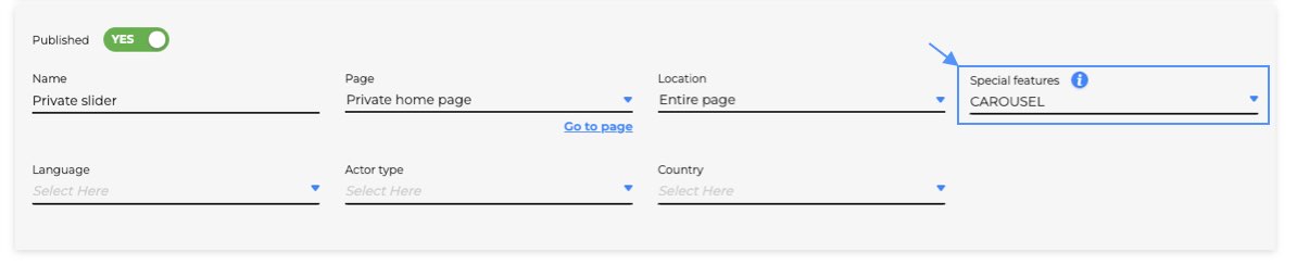
In order to make the content of the article you want to publish more interesting or for any other type of need, the CMS provides extra features that allow you to manage complex structures such as: carousels, sliders, accordions, etc.
These HTML structures always need the support of specific JavaScript and CSS code that the end user is not always able to manage. For this reason it will therefore be sufficient to deal with the HTML relating to the functionality that you want to apply and include it by ticking it, the "special function" of reference.
Carousel
Here is an example of the HTML code needed to create the carousel
<div class="owl-carousel owl-theme">
    <div class="item">
        <a href="/booking/availabilityV2.php" target="_blank">
            <img src="[custom_image_url]">
        </a>
    </div>
    <div class="item">
        <img src="[custom_image_url]">
    </div>
    <div class="item">
        <img src="[custom_image_url]">
    </div>
    <div class="item">
        <img src="[custom_image_url]">
    </div>
    <div class="item">
        <img src="[custom_image_url]">
    </div>
</div>
It is necessary that a div with class="owl-carousel owl-theme" acts as a container for each div with class="item" which will contain either a single image, or linked to an image or other.
It is possible to handle some advanced options via an additional HTML element <input type="hidden" class="owl-carousel-settings"> placed at the beginning of the article.
Options are handled via data-attributes and they are the following:
- number of images to show (data-items="1")
- margin between the images (data-margin="30")
- presence of navigation buttons (data-nav="true")
- presence of navigation dots (data-dots="false")
Example: <input type="hidden" class="owl-carousel-settings" data-items="4" data-margin="60" data-nav="false">
Below is a short video tutorial on how to manage a carousel.
Google Maps
You can embed and customize a Google Map to obtail a result similar to the following:
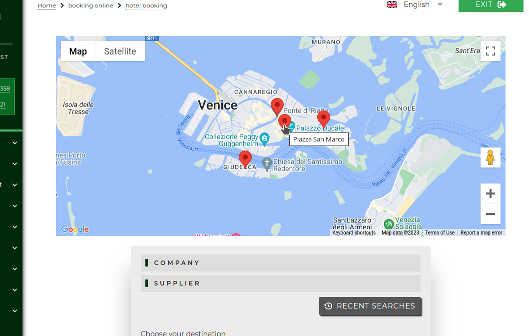
To create a map as you see in the example, you'll need this HTML in your article:
<div class="google-map-settings">
    <input type="hidden" name="map-element-id" value="cms-gmap"> <!-- REQUIRED: ID of the map element (below) -->
    <input type="hidden" name="center-lat" value="45.4334469">   <!-- REQUIRED: Latitude of the map center -->
    <input type="hidden" name="center-lng" value="12.3370927">   <!-- REQUIRED: Longitue of the map center -->
    <input type="hidden" name="zoom" value="13">                 <!-- OPTIONAL: Zoom level between 0 (the entire world can be seen on one map) and 21+ -->
    <input type="hidden" name="disable-default-ui" value="0">    <!-- OPTIONAL: if 1, disable all the map control buttons (zoom, fullscreen, street view...) -->
    <input type="hidden" name="map-type" value="roadmap">        <!-- OPTIONAL: valid values are:
                                                                          · roadmap -> displays the default road map view. (This is the default map type.)
                                                                          · satellite -> displays Google Earth satellite images.
                                                                          · hybrid -> displays a mixture of normal and satellite views.
                                                                          · terrain -> displays a physical map based on terrain information -->

    <!-- If you want to define markers, insert one input with name "marker" for each marker. Use data-attributes to control marker position an naming -->
    <input type="hidden" name="marker" data-lat="45.434187" data-lng="12.338575" data-title="Piazza San Marco">
    <input type="hidden" name="marker" data-lat="45.438066" data-lng="12.335931" data-title="Ponte di Rialto">
    <input type="hidden" name="marker" data-lat="45.435042" data-lng="12.351862" data-title="Arsenale">
    <input type="hidden" name="marker" data-lat="45.425465" data-lng="12.324955" data-title="Giudecca">
</div>

<!-- This is the effective map element. The ID of this element is the one you have to pass to "map-element-id" in the settings above. -->
<!-- Remember to set width and height or the map will not be visible -->
<div id="cms-gmap" class="cms_gmaps" style="height: 400px; width: 100%; max-width: 900px; margin: 0 auto;"></div>
Email form
You can create a custom form with arbitrary input elements. The submit of the form will send an email to the desired email address(es).
The form requires some compulsory params and and some optional ones. A basic form example could be like this:
<form class="towers-cms-email-form">                        <!-- REQUIRED: wrapper element of the form -->
    <input type="hidden" name="to" value="recipient@example.com"/>                          <!-- REQUIRED: email recipient -->
    <input type="hidden" name="from" value="sender@example.com"/>                           <!-- OPTIONAL: email sender -->
    <input type="hidden" name="bcc" value="recipient@example.com"/>                         <!-- OPTIONAL: email cc -->
    <input type="hidden" name="bcc" value="recipient@example.com"/>                         <!-- OPTIONAL: email bcc -->

    <input type="hidden" name="subject" value="New request from CMS from %%ACTOR_NAME%%"/>  <!-- REQUIRED: email subjcet text. %%ACTOR_NAME%% is a placeholder. See below for more -->

    <div class="tui-wrapper">
        <div class="row">
            <div class="form_field col-3">
                <label>Checkin date</label>
                <input type="date" data-customparam="true" name="Checkin" value="2024-10-12"/> <!-- OPTIONAL: email field -->
            </div>

            <div class="form_field  col-3">
                <div class="select_wrapper">
                    <label>Number of paxes</label>
                    <select data-customparam="true" name="Num paxes"> <!-- OPTIONAL: email field -->
                        <option>1</option>
                        <option>2</option>
                        <option>3</option>
                    </select>
                </div>
            </div>
        </div>

        <div class="row">
            <div class="form_field col-5">
                <label>Name</label>
                <input type="text" data-customparam="true"  name="Name"/> <!-- OPTIONAL: email field -->
            </div>
            <div class="form_field col-5">
                <label>Surname</label>
                <input type="text" data-customparam="true" name="Surname"/> <!-- OPTIONAL: email field -->
            </div>
        </div>

        <div class="row">
            <div class="form_field  col-10">
                <label>Brief request description</label>
                <div class="textarea_wrapper">
                    <textarea data-customparam="true" name="Text">Please insert your request here...</textarea> <!-- OPTIONAL: email field -->
                </div>
            </div>
        </div>

    </div>

    <div class="tui-buttons_container add_space_top_short">
        <input type="button" class="btn button_normal towers-cms-form-submit" value="SUBMIT REQUEST"/> <!-- REQUIRED: submit button -->
    </div>
</form>
The only required fields are:
- an input with name="to"
- an input with name="subject"
- an input wuth type="submit" with class="towers-cms-form-submit". Please note: input with type="button" won't work in this case!
You can add as many fields as you want. Every field with a name attribute and data-customparam="true" will be inserted in the email text.
You can customize email behaviour (sender, recipients, copy to...) by setting the optional parameters with name="from", name="cc", name="bcc"
If you want the form to be resetted after a successful submit, you only need to add the attribute data-resetonsubmit="true" to an element (i.e. the submit button).
You can use the following placeholders, their values will be automatically replaced with the data of the user (i.e. %%ACTOR_NAME%% will be the Customer name):
- %%ACTOR_NAME%%
- %%ACTOR_MAILSTAFF%%
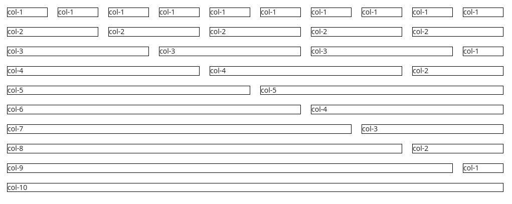
To help you out styling your form, we have implemented a simplified version of bootstrap-like flex grid based on 10 columns.
We have defined some helpers class:
- a div with class="row" will create a row
- an element with col-N (where N is a number between 1 and 10) will occupy a 10/N of the horizontal available space. Margins are added automatically. Please refere to image below to better understand this point.
The following HTML:
<div class="row">
    <div class="col-1" style="border: 1px solid black;">col-1</div>
    <div class="col-1" style="border: 1px solid black;">col-1</div>
    <div class="col-1" style="border: 1px solid black;">col-1</div>
    <div class="col-1" style="border: 1px solid black;">col-1</div>
    <div class="col-1" style="border: 1px solid black;">col-1</div>
    <div class="col-1" style="border: 1px solid black;">col-1</div>
    <div class="col-1" style="border: 1px solid black;">col-1</div>
    <div class="col-1" style="border: 1px solid black;">col-1</div>
    <div class="col-1" style="border: 1px solid black;">col-1</div>
    <div class="col-1" style="border: 1px solid black;">col-1</div>
</div>

<div class="row">
    <div class="col-2" style="border: 1px solid black;">col-2</div>
    <div class="col-2" style="border: 1px solid black;">col-2</div>
    <div class="col-2" style="border: 1px solid black;">col-2</div>
    <div class="col-2" style="border: 1px solid black;">col-2</div>
    <div class="col-2" style="border: 1px solid black;">col-2</div>
</div>

<div class="row">
    <div class="col-3" style="border: 1px solid black;">col-3</div>
    <div class="col-3" style="border: 1px solid black;">col-3</div>
    <div class="col-3" style="border: 1px solid black;">col-3</div>
    <div class="col-1" style="border: 1px solid black;">col-1</div>
</div>

<div class="row">
    <div class="col-4" style="border: 1px solid black;">col-4</div>
    <div class="col-4" style="border: 1px solid black;">col-4</div>
    <div class="col-2" style="border: 1px solid black;">col-2</div>
</div>

<div class="row">
    <div class="col-5" style="border: 1px solid black;">col-5</div>
    <div class="col-5" style="border: 1px solid black;">col-5</div>
</div>
<div class="row">
    <div class="col-6" style="border: 1px solid black;">col-6</div>
    <div class="col-4" style="border: 1px solid black;">col-4</div>
</div>
<div class="row">
    <div class="col-7" style="border: 1px solid black;">col-7</div>
    <div class="col-3" style="border: 1px solid black;">col-3</div>
</div>
<div class="row">
    <div class="col-8" style="border: 1px solid black;">col-8</div>
    <div class="col-2" style="border: 1px solid black;">col-2</div>
</div>
<div class="row">
    <div class="col-9" style="border: 1px solid black;">col-9</div>
    <div class="col-1" style="border: 1px solid black;">col-1</div>
</div>
<div class="row">
    <div class="col-10" style="border: 1px solid black;">col-10</div>
</div>
will produce this result: